Minimalist Interior Design: The Influence of Colors on Space Perception and Organization
The Allure of Minimalist Interior Design
The world of minimalist interior design offers a captivating intersection of aesthetics and functionality, inviting us to rethink our living spaces. This style is more than simply a design trend; it embraces a lifestyle philosophy that prioritizes simplicity and purpose over excess. At the heart of this approach lies a profound understanding of how color shapes our perception of space and influences our overall well-being.
Colors serve as powerful tools in creating ambiance, effectively changing our experience within a room. When embarking on a minimalist design journey, key factors to consider become apparent:
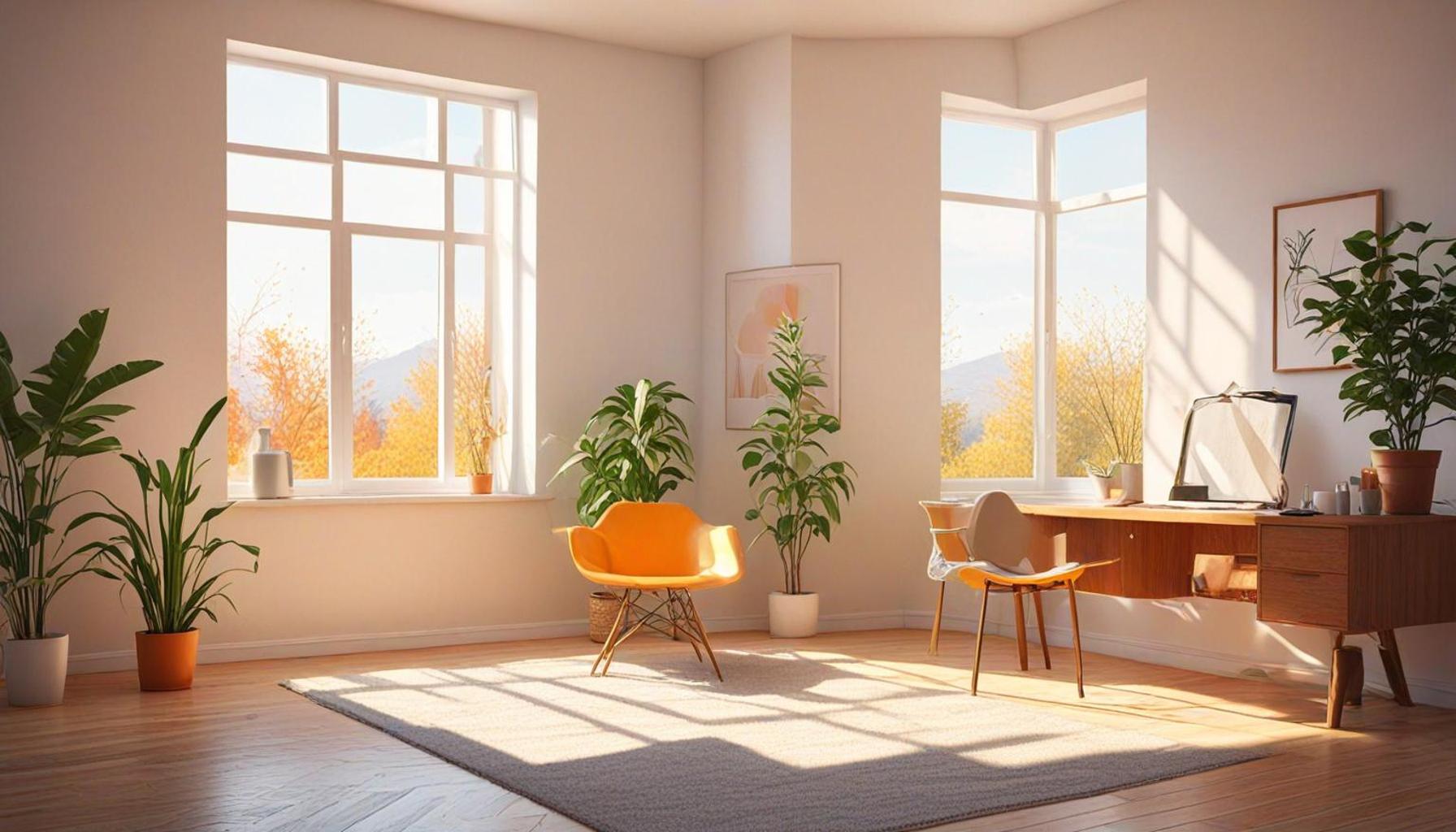
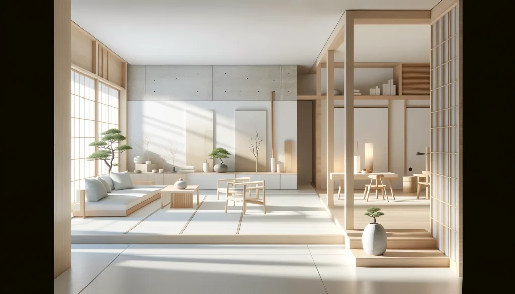
- Light Colors: Light hues such as whites, beiges, and soft pastels often expand our perception, making spaces feel larger and more open. For instance, a living room painted in soft white can evoke a sense of calm and airiness, allowing natural light to reflect and enhance the feeling of openness.
- Dark Tones: On the other end of the spectrum, deep colors like navy blue, charcoal, or forest green can create a sense of intimacy and warmth, ideal for smaller areas. A cozy reading nook with dark walls can become a sanctuary that invites relaxation and contemplation.
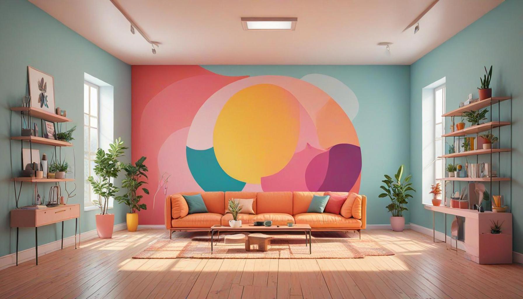
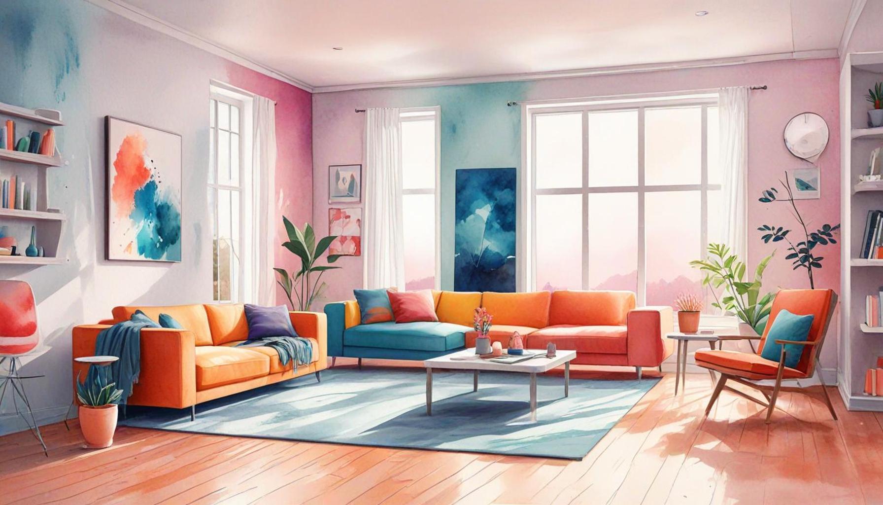
- Accent Colors: Introducing accent colors in a minimalist environment can establish focal points that draw the eye without overwhelming the space. A bright yellow chair or a vibrant piece of artwork against a neutral backdrop can become a stunning highlight, adding character and depth.
By strategically selecting colors, homeowners and designers can manipulate space perception remarkably. Consider a modern studio apartment: by using a pale palette for the walls and furniture, the space can transform into a serene oasis that lures you in. Conversely, incorporating earthy tones, such as terracotta and olive green, can infuse warmth and character while maintaining a simple aesthetic.
This exploration of color choices reveals a compelling relationship with minimalist designs, unraveling how specific coloration influences our visual experience and aids in organizing space effectively. To illustrate, consider how adding a few potted plants with lush greenery can not only bring vibrancy but also balance the minimalist ethos by enhancing natural beauty and tranquility.
Furthermore, the choice of materials plays a significant role in minimalist design. Pairing colors with natural textures, like light wood floors or soft linen fabrics, can provide an additional layer of depth while maintaining the essential simplicity. Designers and homeowners alike are encouraged to consider the tactile quality of elements, as the interplay between texture and color can elicit a rich sensory experience that transcends mere visual appeal.
In conclusion, minimalist interior design invites a thoughtful exploration of how color impacts our spaces and ourselves. It challenges us to be intentional with our choices, creating environments that are harmonious, functional, and serene. Through careful color selection, one can not only beautify a space but also enhance our daily experience, making our homes true reflections of our values and aspirations.
DISCOVER MORE: Click here to simplify your life
The Power of Color in Minimalist Spaces
Color is not just a visual aspect of design; it’s a dynamic element that can significantly alter our perception of a space. In the realm of minimalist interior design, color choices become essential in crafting environments that embody tranquility and functionality. Understanding how different colors interact within a room can empower homeowners to create striking yet simple living spaces.
When contemplating color selection in minimalist interiors, it’s crucial to recognize how our psyche is influenced by various shades. For instance, light colors often dominate minimalist palettes as they impart an illusion of spaciousness and serenity. The strategic application of these hues can alter our mood and feelings towards the environment:
- Whites and Neutrals: These shades not only reflect light but also present a clean and uncluttered look. Areas painted in white or soft cream can create a blank canvas, allowing for easy manipulation of other design elements. This approach is especially beneficial in smaller homes, where keeping the space feeling expansive is a priority.
- Pastels: Light pastel colors, such as mint green, blush pink, or powder blue, introduce a gentle touch of color without overwhelming the senses. These variations can subtly influence mood, promoting feelings of calm and comfort, which are integral to the minimalist style.
- Earthy Tones: While light colors are popular, muted earthy tones like taupe or terracotta can convey warmth and stability. When used thoughtfully, these shades can soften a space, creating inviting nooks that encourage relaxation and introspection.
On the contrary, darker tones have their place within the minimalist philosophy, as they can enhance intimacy and richness in a space. Deep shades like navy, charcoal, or forest green can articulate architectural features, creating dramatic focal points that provide a sense of comfort and solidarity, especially in larger rooms. For example, a dining area adorned with deep green walls can prompt appreciation for the organic, natural elements, allowing the dining experience to blossom.
Moreover, incorporating accent colors within a predominantly neutral scheme can invigorate a minimalist design. This technique involves using pops of vivid colors sparingly to avoid overwhelming the space while still providing visual interest. Bright artwork, a singular piece of furniture, or even decorative cushions in vibrant hues can serve as engaging focal points that draw attention without cluttering.
In terms of organization, color can play a pivotal role in delineating spaces, especially in open-concept designs. Different areas can be subtly defined using a variety of shades that create zones without the need for physical barriers. This method not only maintains an open aesthetic but also facilitates a natural flow that is essential in contemporary minimalist living.
Ultimately, the role of color in minimalist interior design transcends mere decoration. It serves as a guiding principle that influences our emotional experiences and physical interactions within a space. In the following sections, we will delve deeper into practical applications and the psychological effects of colors explored through real-life case studies and expert insights.
Exploring the Impact of Color in Minimalist Design
In minimalist interior design, the use of color is not just about aesthetics; it’s a vital tool that influences how we perceive and organize our spaces. Colors can affect our emotions, create illusions of space, and enhance functionality. For instance, light colors such as whites, creams, and pastels can make small spaces appear larger and airier. By reflecting light, these shades open up cramped areas, promoting a sense of freedom and tranquility.On the other hand, darker hues like navy or charcoal can add depth and sophistication, effectively creating cozy and intimate environments when used properly. The key is to strike a balance between bold details and serene backgrounds, which contributes to an atmosphere of calmness – a cornerstone in minimalist philosophy. Soft accents of color serve to punctuate rooms without overwhelming them, preserving the essential simplicity that is the hallmark of minimalist design.Moreover, the psychological effects of color must be considered. For instance, studies have shown that blue promotes relaxation, making it an excellent choice for bedrooms or reading nooks. Conversely, yellow, associated with energy and cheerfulness, can invigorate spaces like kitchens or home offices. By understanding how colors function within a space, interior designers can curate environments that align with the intended mood and purpose, enriching the user’s experience.In addition to setting the emotional tone, colors can also dictate the organization of a space. A well-chosen color palette can guide the flow of movement and the hierarchy of physical space. For example, zoning areas with distinct yet harmonious colors can delineate function without the need for actual barriers. This further supports the minimalist ethos, which values openness and fluidity in design.Incorporating thoughtful color choices allows for an exploration of minimalist interior design that goes beyond simply reducing clutter; it opens a dialogue about how spaces interact with their inhabitants. This intersection of color and minimalism deserves further examination, as it holds the potential to transform how we experience the environments we live and work in.
DISCOVER MORE: Click here for innovative storage solutions
Transformative Effects of Color Psychology in Minimalist Design
The relationship between color and psychological well-being is a nuanced one, particularly within minimalist interior design. As dictated by the principles of color psychology, the hues we choose can elicit a range of emotional responses that ultimately shape how we experience a space. This phenomenon is vital for homeowners and designers aiming to curate environments that resonate positively.
Research demonstrates that specific colors correlate with particular psychological effects. For instance:
- Blue: A color commonly associated with tranquility and introspection, blue can be particularly impactful in spaces intended for relaxation. Applying a soft blue on the walls of a bedroom or home office can provide a soothing environment conducive to focus and calmness, mirroring the expansive sky.
- Yellow: Known for its association with joy and energy, yellow can invigorate a space when used in moderation. Small pops of bright yellow—whether through cushions, art pieces, or ceramics—can inspire creativity and liveliness, making them effective in areas like kitchens or workspaces.
- Green: Nature’s hue, green symbolizes growth and renewal. Incorporating varying shades of green, especially softer ones, into minimalist interiors can foster a sense of connection to the outdoors, promoting a restorative atmosphere that enhances overall well-being.
Also, the placement of colors within a space can amplify their effects. For example, a dominant color scheme can be enriched through the strategic location of accent colors. A spare living room decorated in subtle greys could dramatically shift in character with the addition of a vibrant orange throw blanket or an eye-catching piece of wall art. Such intentional contrasts enhance visual depth, ensuring that minimalist interiors retain vibrancy without clutter.
Color and Spatial Functionality
In minimalist design, the application of color not only influences mood but also enhances spatial functionality. Color can serve as a powerful organizational tool when it comes to spatial arrangement. For instance, using different color shades can effectively demarcate zones in open-concept spaces. A dining area painted in a subtle sage green can delineate it visually from a white-schemed living room while maintaining cohesion across the overall design.
Moreover, color can guide movement and intention within a space. Transitioning from light to dark shades can indicate pathways or flow, subtly instructing individuals on how to navigate their surroundings. A hallway featuring varying tones of beige could create an inviting passage to a bold, colorful living room, inviting occupants to explore while maintaining a minimalist ethos.
The Minimalist Palette: Seasonal Variations
While the classic minimalist palette tends to lean towards neutrals and pastels, it is also responsive to seasonal changes. Adapting color schemes to reflect the changing seasons can invigorate a home. In spring and summer, pastel hues can connect a home to the refreshing landscape outside; conversely, warmer, richer colors may be integrated during the fall and winter months to create an ambiance of coziness and warmth. This fluidity allows homeowners to embrace the essence of minimalism while still reflecting the external world throughout the year.
On a practical level, the use of color in minimalist design requires thoughtful curation—not an overflowing assortment. By carefully selecting and applying color strategically, homeowners can create harmonious spaces that not only look stunning but serve their intended purpose effectively, emboldening the true spirit of minimalist design. This flexibility opens up vast possibilities for personalization, exemplifying that minimalism is not just a design choice but a thoughtful, expressive lifestyle. The journey of color within minimalist interiors is one that reflects identity and promotes well-being, engaging the senses while honoring simplicity.
DISCOVER MORE: Click here to learn how to master the art of saying no
Conclusion
In the realm of minimalist interior design, color emerges as a pivotal element that transcends mere aesthetics. The interplay between shades and spatial organization profoundly influences our perception and interaction within a space. Understanding how colors can evoke feelings of tranquility, joy, or vitality allows homeowners and designers alike to create environments that are not only visually pleasing but also emotionally nurturing.
The application of color psychology in minimalist designs highlights its role as a transformative tool. By thoughtfully curating color palettes, individuals can define spaces, elevate functionality, and shape atmospheres that resonate with personal identity. From the serene blues that invite relaxation to the zesty yellows that energize creativity, every hue carries the potential to enhance well-being and foster a meaningful connection to the environment.
Moreover, as trends evolve and seasons change, so too can the color schemes within a home, providing an adaptable canvas that reflects the rhythms of nature and our daily lives. This adaptability emphasizes that minimalism is not merely about eliminating clutter, but rather about embracing simplicity that promotes clarity, focus, and enriched experiences.
As we delve deeper into the transformative effects of color in interiors, one undeniable conclusion stands: the choices we make in color not only define our spaces but also echo our emotional landscapes. This realization invites us to explore the creative possibilities of minimalist interior design, encouraging further inquiry into how we can curate our living environments for optimal organization and lasting harmony.